Branding is a key component for anyone setting up a business as it’s what your audience will use to identify and connect with you. A great brand has a great story and I wanted to share with you why I chose my colours and my logo and what they represent about me and my business.
The story behind my brand is quite simple really, I knew that I wanted to stand out from the crowd and be known for being a professional Virtual Assistant offering a personalised and trustworthy service which I think is really important to business owners who are embarking on using a Virtual Assistant for the very first time.
MY VISION
As soon as I made the decision to become a Virtual Assistant, I began to visualise having my own logo and my own website. I began looking at how other websites were laid out and also different branding boards to check out logos, fonts, colours and styles and knew I wanted to use dark bold colours with a mix of lighter colours that would compliment each other.
I also started calligraphy a few months ago so wanted to incorporate this into my logo somehow so that it is a reflection on my creative side.
To create my brand and bring my vision to life, I worked with web designer and branding expert, Raquel at The Mighty Fox. I’d put together some Pinterest boards with all my ideas and sent these over to Raquel.
During a call we discussed who my audience were e.g. legal professionals and small business owners and just over a week later she sent over my branding board. I loved everything about it and knew I wouldn’t change anything, it was perfect.
I could have probably done it myself but I wanted everything to be professional as that is what my business stands for, I offer professional services to professional people and as a result I’ve ended up with a gorgeous looking brand that I’m really proud of.
LOGO

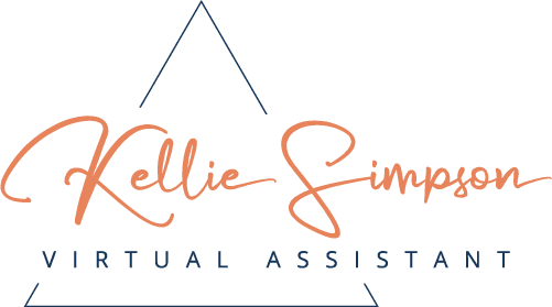
A calligraphy inspired font was chosen for my name suggesting a personal touch in the service I will be providing, with a sturdy font for Virtual Assistant which complements my name nicely, conveying professionalism, reliability and the practical service I offer.
Corners are, by definition sharp and abrupt and the triangle was chosen as my main logo icon, as just like the sturdiest shape in nature, my service is designed to support.

COLOURS
Just like the overall design is a marriage between formal and personal, so were the colours selected to bring together the calm and dependable nature of blue with the vibrant and optimistic vibe of orange.
Navy blue is responsible, trustworthy and intelligent. You can rely on blue to be tactful, reliable and always do the right thing, instilling trust, loyalty and sincerity.
Orange is enthusiastically optimistic and personal. You’ll find orange being friendly, welcoming, cheerful and creative with a sense of ‘get up and go’.
An additional selection of colours; peach, light blue and grey was chosen to complement the palette and support the brand feel and I couldn’t be happier with how my brand has turned out.
As an individual and throughout my career, I’ve always prided myself on having many admirable traits such as those listed above and it’s great to have a brand that I understand and can connect with.
Why did you choose your branding colours and logo and what do they represent?
